
Redesigning the NFL game management experience
Improving the web application NFL personnel use to manage game day operations
ROLE
Lead UX/UI designer
TIMELINE
3 months
PROJECT TYPE
Responsive web application UX/UI design
CLIENT
National Football League (NFL)
The players on the field are the most visible during a football game, but the NFL also employs hundreds of behind-the-scenes personnel who ensure that game day operations run smoothly. These staff members handle critical tasks such as inspecting uniforms, spotting injuries, facilitating ad breaks, maintaining equipment, and managing incidents. To support them, the NFL uses an internal web-based application called the Game Management System (GMS).
Overview
The current GMS needed a more efficient user workflow, a visual refresh, and a rebuild of the system from the backend. The system users, different personnel types with a unique set of tasks and responsibilities, each required an interface designed to support them in accomplishing their respective tasks.
The problem
Our challenge was to redesign and rebuild the GMS before the NFL playoff season began in January, ensuring it catered to the distinct needs of various game day personnel.
The goal
A newly redesigned game management experience, both for web and mobile, that was successfully trialed by personnel before the end of the NFL season
The outcome

The current app, in desperate need of a redesign
PROJECT PLANNING
Creating the project approach
Given the fast-paced timeline (3 months to design, build and test), I structured the project approach around rapid iteration cycles and close collaboration with the development team. I involved the developers in all research and co-design sessions, ensuring shared knowledge from the start of the project. I created a project timeline that divided each user workflow into a sprint and stacked design, development, and QA activities concurrently, so that we could utilize the team and the available time most efficiently.

A visual sprint timeline I created to communicate with the team and stakeholders
DISCOVERY
As soon as the project kicked off, we knew we had the massive task of creating an application to meet the needs of seven different user roles. Each of these users, NFL game day personnel, need to complete different tasks and require unique workflows to get their jobs done. Tasks are completed pre-game, during games, and post-game.
So with a very tight timeline and six different roles to understand, I decided to hold a one day research intensive. I booked one day in the calendar, and asked our NFL stakeholders to schedule 1 hour blocks of time with a representative from each user group. The entire project team gathered in a meeting room, got on a conference call with NFL headquarters in New York City, and interviewed users for a whole day.
Prior to the day, I created a questionnaire and sent it out to all the interviewees, who were required to complete it before their interview. I had the chance to look over their responses and share them with the team ahead of time. We went into intensive day armed with baseline knowledge of each role, questions we needed answered, and the ability to facilitate a much richer, informed conversation.
Leading a one day research intensive
IDEATION
Co-designing features with developers
Full of insights about the users we were building for, I facilitated ideation and sketching sessions with my development team. Developers are often hesitant to get involved with sketching or discredit their design skills, but they have such a wealth of knowledge and unique perspective to contribute. Together we sat in front of a white board wall and worked through various use cases and workflows. We threw out ideas, discussed all the pros and cons, sketched them out, and revised. And because I had both front and backend developers participating in these activities, we were all aligned on the functionality of the design before I even started designing (amazing).

Collaborative whiteboard sketching sessions with the development team; co-designing user workflows
DESIGN
Creating a scalable design system
After defining and understanding the various user roles and workflows, our goal was to create a design system with reusable patterns, components, and templates that could be applied across the entire application. Our stakeholders wanted to created a consistent look aligned with NFL brand, and we knew establishing a design system would create efficiencies to save valuable production time and help us meet our tight timeline.
While each personnel role had a set of unique tasks to complete, they also shared common elements across each of those tasks. For example, an Incident Manager might search for any incidents in a given week during the season, while a Uniform Inspector might search uniform violations for a specific player or team. The design system enabled us to create consistent search form elements someone in any role could use, while displaying custom search fields based on the role of the user logged into the app.

The design system created for the application, incorporating NFL brand guidelines

The design system in action, applied across different elements of the application: 1) user notifications; 2) league-wide and individual personnel stats by week; 3) filter functionality for different roles; 4) form capturing new data entries
COLLABORATIVE PROBLEM SOLVING
Solving design challenges in real-time
With the design requirements changing almost daily, this was another benefit to working so closely with my dev team. I would create a mockup, sit down with my developers, and together we would iterate on the mockup. Once we received feedback from the client or a new set of requirements, we would repeat this same process.
Sometimes I would move elements around on the screen and we’d try out different ideas, or sometimes my front end developer would create a mock-up directly in the browser. If I got stuck on a design problem, I called the devs over and asked for their ideas about how I should solve it. I found their technical expertise invaluable because we needed solutions that were user friendly but that could be feasibly developed in a short amount of time.
A particularly complex design challenge popped up one day when our primary stakeholder at the NFL requested a data heavy table for the Incident Management Dashboard. Users needed to scan and quickly locate information on this table, which would display filtered search results and also needed to be responsive. I had presented an initial design concept that did not incorporate a table, which was how we learned that the client did, in fact, want the data displayed on a table.
After the design review, I sat down with my developers and together we moved design elements around on the screen for hours in an effort to find a solution that was clean, easy to scan, presented all the required data fields, and responsive. We arrived at a solution: recommending we only show the most important categories on the table. Users can click into a detail screen with the full data and the option of editing details about a specific entry. We also created a robust filter feature that would allow users to locate specific entries from hundreds of potential results.
Thanks to our agile problem-solving approach, we ensured stakeholder needs were met while preserving usability. And importantly, by turning around their design request so quickly, we maintained our stakeholders’ trust in the team.
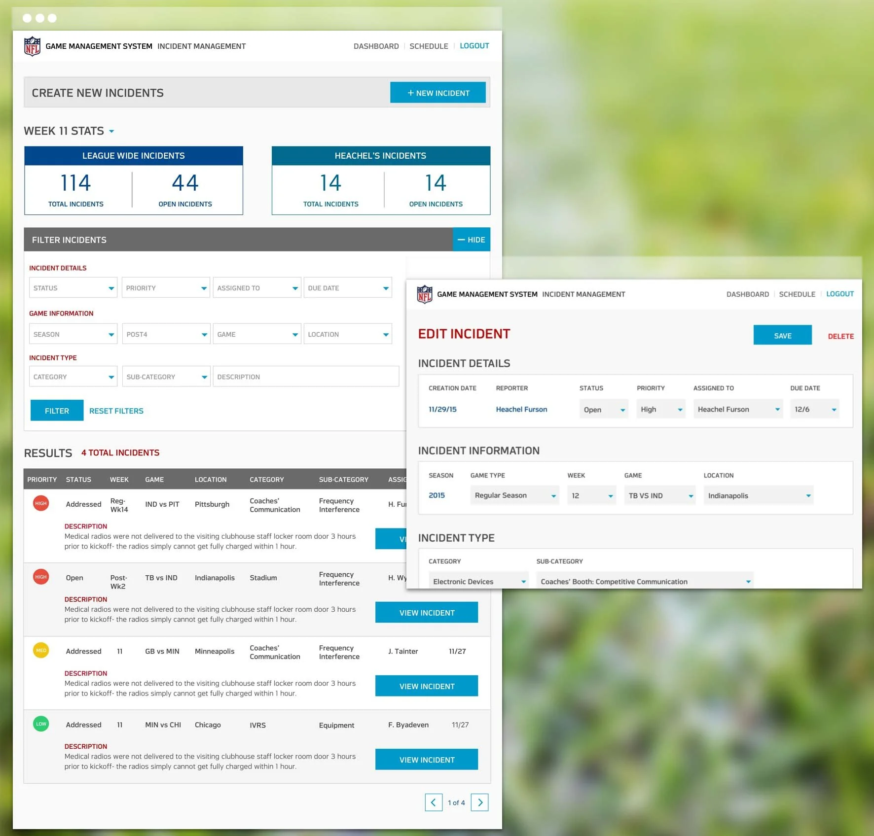
Incident management dashboard, the most important details displayed in the table with the ability to filter results and edit individual incidents

Additional screens created for the Game Management app, showcasing tasks and actions required for various personnel
OUTCOMES & IMPACT
Through strategic planning, stakeholder engagement, and close cross-functional collaboration, we successfully redesigned the GMS on time for the NFL playoffs. I’m immensely proud of the work we did on this project and how smoothly the team worked together.
The key outcomes from this project:
➡️ Improved user workflows, tailored to the needs of game day personnel.
➡️ Maintaining strong stakeholder trust, built through iterative, transparent design processes, and communicating our rationale for solving problems.
➡️ A scalable design system, enabling future enhancements to the application.
➡️ Team efficiency, thanks to the early and consistent involvement of the development team in research and ideation and our ability to solve problems collaboratively.
The project’s success led to the NFL requesting additional user roles and functionalities, proving the long-term value of our approach.
A newly redesigned application + one happy client
REFLECTIONS
When I first caught wind of this as a potential project, it was pretty tough to hide my excitement. I’m a huge NFL fan, as were several of my teammates. This was a dream project for me, not only because of my love for football, but also because I was knowledgeable about the subject matter. I got involved with the project from the very early stages, inserting myself into the sales process to help win the work and ensure the design was given the attention it required.
Being the only designer on such a large, fast-paced project with detailed design requirements could easily have caused me huge amounts of stress — but I never felt that way, thanks to my team. We worked together every step of the way.
I pushed for the entire team, developers included, to participate in discovery workshops and research activities held remotely with the client before we even started building. I believed this was crucial to the success of the project, since we’d be designing and developing in tandem. The developers also got to be part of valuable discussions that helped them understand who they’re building the app for. Had they not been part of these discussions early on, I don’t think we would have been able to execute the project as effectively as we did.
This project reinforced my belief that collaboration and iterative design are key to tackling complex challenges, and that any member of the team, regardless of their discipline, can play an active role in shaping design solutions. By embedding research into development, fostering cross-team alignment, and maintaining flexibility, we delivered a solution that not only met a tight deadline, but also enhanced game day operations for NFL personnel.
The dream project & the dream team
check out more of my work

